
Flexbox
Flexbox refers to the layout mode displayed when an element's display rule is set to flex or inline-flex in CSS. It was primarily created to solve the challenges of efficient and flexible layout, alignment, and page layout on mobile devices. Before Flexbox appeared, page layouts were usually implemented using floats or absolute and relative positioning, but traditional layout methods proved to have insufficient expressiveness and made layouts cumbersome and inflexible in the face of increasingly cool and sophisticated design mockups.
What is Flexbox?
Flexbox refers to the layout mode displayed in CSS when an element's
display rule is set to flex or inline-flex .What problem is it mainly meant to solve?
- Efficient and flexible layout and alignment. Before Flexbox appeared, page layouts were usually implemented using floats or absolute and relative positioning. There were not many layout methods, but they were barely usable. However, later on, with the rapid development of front-end technology and the rapid iteration of page layout requirements, traditional layout methods appeared insufficiently expressive in the face of increasingly cool and sophisticated design mockups, and layouts became troublesome and inflexible. This was especially true for element alignment, which often required considerable effort and various tricks to achieve. The emergence of Flexbox as a layout method can be seen as an attempt to solve the problem of layout and alignment.
- Solving the difficulty of page layout on mobile devices. Today there are more and more smart devices, and more and more device sizes. Obviously, developers cannot provide a solution for every screen size; they can only provide a general solution to adapt to all kinds of devices. Furthermore, most smart devices today support screen rotation. Screen rotation affects page layout to a certain extent. This problem is also beyond the power of traditional layout methods, or rather, so far there is still no very elegant solution to this problem, until the emergence of Flexbox.
How to use Flexbox
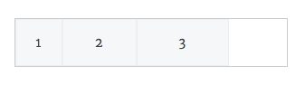
Suppose we have the following HTML code snippet:
<div class="flexbox-parent">
	<div class="flexbox-children child-1">1</div>
	<div class="flexbox-children child-2">2</div>
	<div class="flexbox-children child-3">3</div>
</div>
.flexbox-parent {
border: 1px solid #ccc;
display: flex;
width: 300px;
margin: 20px auto;
}
.flexbox-children {
background: #f5f7f8;
line-height: 50px;
height: 50px;
text-align: center;
border: 1px solid #eee;
}
.child-1 {
width: 50px;
}
.child-2 {
width: 80px;
}
.child-3 {
width: 100px;
}
For flexbox-parent
display
When set on the parent element
display:flex or display:inline-flex , a Flexbox context is created in the parent element and child elements.Flexbox can have two types: one is block, and the other is inline-block.
.flexbox-parent {
	display: flex; /* or inline-flex */
}
flex-direction
Unlike the traditional document flow, Flexbox allows you to set the arrangement of child elements, which can be either vertical or horizontal. However, a single Flexbox can only use one arrangement.
.flexbox-parent {
	flex-direction: row(default value) | row-reverse | column | column-reverse;
}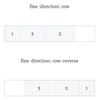
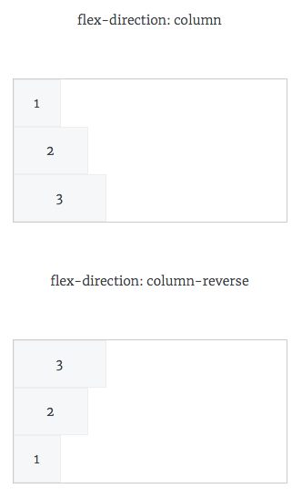
flex-direction:row and flex-direction: row-reverse arrange horizontally, among which row-reversearranges from right to left.flex-wrap
and
white-space: nowrap similarly, for flexbox-parent, you can also set the behavior of whether wrapping is needed when the element length exceeds the parent element's width:.flexbox-parent {
flex-wrap: nowrap (defalut value) | wrap | wrap-reverse;
}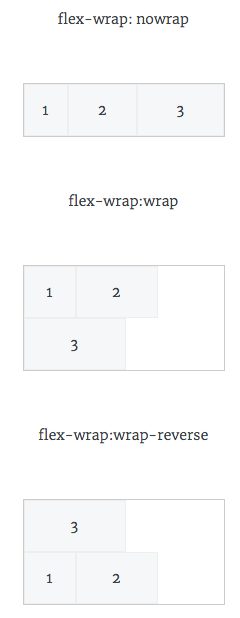
The default behavior is no wrapping, meaning it always stays on one line.
flex-wrap: wrap allows child elements to wrap automatically, and the direction is the same as the default direction, that is, from left to right. While flex-wrap: wrap-reverse wraps with a direction opposite to the default direction. As you can see, Flexbox provides very precise control over the direction of child elements.flex-direction and flex-wrap These two rules can be abbreviated into one rule:.flexbox-parent {
flex-flow: <flex-direction> <flex-wrap>;
}flex-flow The default value of row nowrap 。justify-content
Another difference from traditional layout is that Flexbox can control the horizontal spacing between child elements very easily:
.flexbox-parent {
	justify-content: flex-start (default value) | flex-end | center | space-between | space-around;
}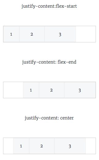
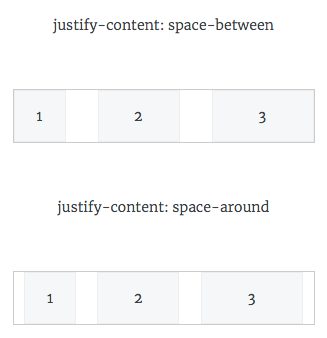
- flex-startThe first child element of the Flexbox will be flush against the left side of the parent element, and the following child elements will follow immediately to the right. When the total width of all child elements is less than the width of the parent element, blank space will be produced on the far right. This is the default behavior.
- flex-endand
flex-startis the opposite: the last child element is flush against the right side of the parent element, and the preceding child elements follow immediately to the left. - centerNeither the first child element nor the last child element is flush against the two sides of the parent element; instead, all child elements are placed close together and centered horizontally, leaving blank space on both sides.
- space-betweenis
flex-startandflex-endis a fusion of the two, but not entirely a fusion of them. In this mode, the first child element is flush against the left side of the parent element, the last child element is flush against the right side of the parent element, and the gaps between the middle child elements are equal. space-around - space-aroundand
space-betweenis similar, except that the first element and the last element are not flush against the two sides of the parent element; instead, the gaps on both sides are equal. align-items
align-items
In addition to controlling the horizontal spacing of child elements, Flexbox can also control the vertical alignment of child elements.
.flexbox-parent {
	align-items: flex-start | flex-end | center | stretch (default value) | baseline;
}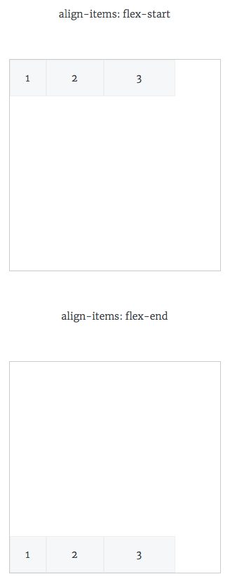
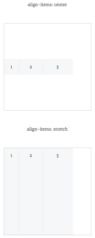
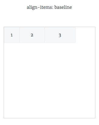
- flex-startwill align the child elements vertically to the top of the parent element.
- flex-endis the opposite: the child elements are aligned vertically to the bottom of the parent element.
- centeras the name suggests, centers them vertically.
- stretchmakes the height of the child elements equal to the height of the parent element. This is the default display mode.
- baselinealigns vertically based on the text baseline within the child elements.
align-content
and
justify-content is similar: when the child elements inside the parent element span multiple lines, the spacing between lines can be controlled using align-content to control it:.flexbox-parent {
align-content: flex-start | flex-end | center | stretch (default value) | space-between | space-around;
}For the specific property effects, refer to
justify-content 。For flexbox-children
order
By default, the arrangement of child elements is determined by the order of the code. However, for Flexbox child elements, you can change the arrangement position of child elements by adding the
order rule to change the arrangement position of child elements..flexbox-children {
order: <interger>;
}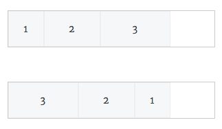
When the
order property is set, the positions among child elements are then arranged by order value, and are no longer determined by the order of the code.flex-grow
When the total width of the child elements inside a Flexbox cannot fill the width of the parent element, you can use
flex-grow to set whether to automatically increase the width to fill the blank space..flexbox-children {
flex-grow: <number>; /* default 0 */}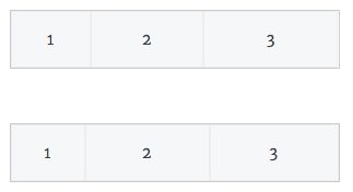
flex-grow Accepts numbers, but negative numbers are invalid. When all child elements are set to 1, the horizontal blank space will be divided equally into several parts, and then added to the widths of the child elements to fill the blank space. And when a certain element is set to 2, then this child element will be allocated 2 times the blank space.flex-shrink
flex-shrink rule can be used to enlarge or shrink the child element itself..flexbox-children {
flex-shrink: <number>; /* default 1 */}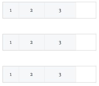
flex-shrink Accepts numbers, but negative numbers are invalid.flex-basis
flex-basis: <length> | auto This rule will not be discussed because browser support is not very good.Among the several Flexbox child element rules mentioned above, except for
order , all can be represented using a shorthand rule:.flexbox-children {
flex: none | [ <flex-grow> <flex-shrink> ? || <flex-basis>]
}flex The first parameter is flex-grow , the second parameter and the third parameter are optional. The default value is 0 1 auto . It is recommended to use flex this rule to set flex-grow 、flex-shrink、 flex-basis these three rules.align-self
The above
flexbox-parent section mentioned that you can use align-items to vertically align the child elements of a Flexbox, however in flexbox-children , you can use align-self to override the default vertical alignment..flexbox-children {
align-self: auto | flex-start | flex-end | center | baseline | stretch;
}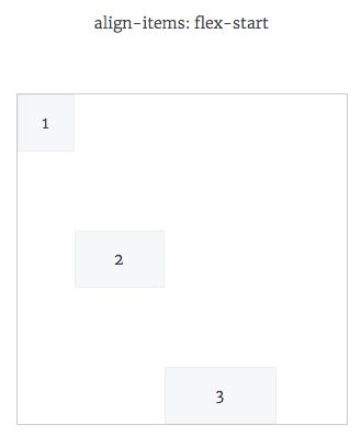
For an explanation of the specific property values, refer to
align-items 。Things to note
float ,clear ,vertical-align rules do not apply to Flex elements.Use cases
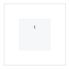
Perfect centering
.flexbox-parent {
    display: flex;
    height: 300px;
    align-items: center;
    justify-content: center;
}
.flexbox-children {
    width: 100px;
    height: 100px;
}
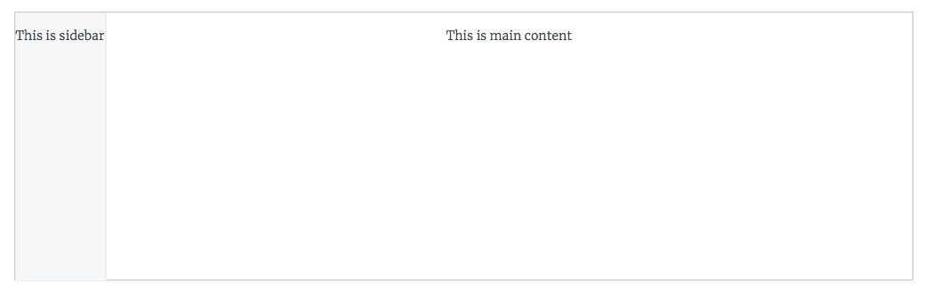
Adaptive two-column layout
.flex-27 {
    height: 300px;
    width: 60%;
}
.flex-27 .left {
    width: 100px;
    height:100%
}
.flex-27 .right {
    flex-grow: 1;
    height:100%;
    background: none;
}
Navigation bar with a button on the right
.flex-28 {
    border-radius: 3px;
    padding:10px 5px;
}
.flex-28 a {
    padding: 0 10px;
}
.flex-28 .left {
    flex-grow: 1
}
Bugs currently present in Flexbox implementations across browsers
Unfortunately, although many browsers now support Flexbox, there are still many bugs. Specific issues can be found on https://github.com/philipwalton/flexbugs .
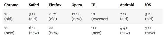
Browser compatibility
Flexbox currently has three versions:
- (new) The latest version, whose syntax is the one mentioned above:
display: flex - (tweener) The unofficial syntax that appeared starting in 2011:
display: flexbox - (old) The syntax that appeared starting in 2009:
display: box