

Page Load Performance Optimization Solutions
Why do we need performance optimization? Before answering this question, ask yourself: would you wait more than 10 seconds for a page to load? Or would you use a page where clicking a button takes several seconds to respond? I think most people would not. Clearly, human patience is limited. If a page's load time or response time exceeds a person's patience, they are very likely to leave the page. This is why performance optimization is necessary. Performance optimization is about enabling users to open pages as quickly as possible and use them as smoothly as possible.
Why do performance optimization?
Before answering this question, first ask yourself: would you wait more than 10 seconds for a page to load? Or would you use a page where clicking a button takes several seconds before there is any response? I think most people would not. It is obvious that human patience is limited. If a page's load time or response time exceeds their patience, they will very likely choose to leave the page.
This is why performance optimization is necessary. Performance optimization means enabling users to open pages as quickly as possible and use pages as smoothly as possible. An article on Google Developers:Why Performance Mattersexplains in detail why performance optimization is so important.
Of course, performance optimization is already a well-worn topic. How to optimize page performance so that users can browse pages faster and consume pages more smoothly is a piece of knowledge that every Web engineer needs to master.
At the same time, performance optimization is a very vast topic, and it is impossible for me to cover it all in a single article. In this article, I will mainly discuss the performance optimization solutions that I have actually used or learned about.
Prerequisites
Although performance optimization is a required course for Web developers, this does not mean that every project must achieve perfection in every aspect. Before starting optimization, you need to first do the following two things:
First, understand your business and your users
This step is very important, as it will determine your optimization direction and approach. The traffic scale of the business, the target user group, and the device and network conditions of the target user group all need to be understood.
The traffic volume can usually determine whether optimization is currently needed. For example, if the current business has a daily PV of less than 100, then even if you apply a great many optimization measures, you may not be able to draw many conclusions from the data, because the volume itself is too small and the data fluctuations will be especially large. At this point, you cannot tell whether the data fluctuations are normal fluctuations or improvements brought about by optimization. Based on my current experience, when a page's daily PV reaches more than 10,000, the data becomes somewhat more stable, and appropriate optimization can be done. If it is 100,000 PV, or 1 million PV, the data will tend to be even more stable. At this point, if you have done optimization and it is effective, then the fluctuations in performance data can reflect the optimization effect fairly directly. From my experience, when traffic is relatively small, the performance data improvement brought by an increase in traffic is often much better than the data improvement brought by constantly optimizing while the volume is small. For example, we had a page whose daily PV was usually just over 10,000, and at that time no matter how we optimized performance, the data just would not improve. Then one day the traffic doubled to more than 20,000, and the performance data suddenly improved. This is because the larger the base, the more the data can reflect average performance.
The business's target users are also very important. After all, our pages are ultimately meant to serve users. To let users open our pages faster, we need to deploy our pages as close as possible to the regions where our target users are located. If your target users are in the United States, but your servers are set up in China, then the access speed will definitely be greatly reduced.
In addition to knowing the users' region, you also need to understand the devices users use and the browsers they use. Do users access the page on Android phones, iPhones, or all on computers? Once you know the platforms, browsers, and versions that users use, you can know what features we can use on these platforms and browsers.
Understanding the project situation and the user situation is all for finding direction for performance optimization. Once you have grasped these two points, when doing optimization you can know fairly clearly which solutions have a positive effect on improving the data and which solutions are unnecessary to do, so that you can maximize performance gains.
Find the bottleneck, and optimize for the bottleneck
In addition to understanding the project and its users, we also need to understand the current bottlenecks of the project. When a page loads slowly, where exactly is the slowness—is it slow server response, slow resource downloads, or slow rendering? Once we identify the bottleneck, we know the priority for optimization, and we can then carry out targeted optimization against the bottleneck to solve the performance problem.
How to measure
The words "fast" and "slow" are themselves very subjective. Some people think a page is only fast if it loads within one second, while others think a page that loads within five seconds is not slow. To measure whether a page loads fast or slow, we often define some metrics and judge whether it is fast or slow based on the data from those metrics.
For page loading performance, the currently common metrics for measurement include First Paint, First Contentful Paint, First Meaningful Paint, and page onload time, among others. Except for First Meaningful Paint, which cannot be statistically captured through code, the other metrics can all be obtained through browser APIs. In fact, browsers provide relevant APIs for developers to obtain performance data, such as
window.performance.timing can be used to analyze the overall loading situation of the page, including DNS lookup time, TCP connection time, page download time, page interactive time, and so on. You can even use window.performance.getEntries() to obtain all performance data of the page, including the loading performance data of each resource.Now that we have performance metrics and know how to obtain the data, how do we measure it? There are two ways to measure: one is for developers to measure through performance analysis tools, and the other is to collect the access performance data of real users and finally obtain the final performance data through calculation and analysis. The former is more commonly done through Lighthouse ,webpagetest these tools for performance analysis. The latter is what is called RUM (Real User Monitoring), large companies usually build their own RUM systems, and of course there are also some RUM services on the market. They are all used to collect data on real users. After all, sometimes the results developers get from their own testing can differ significantly from the actual results of real users. Most of the time, when we talk about performance data, we mean RUM data.
Through a RUM system, you can conveniently observe and analyze performance data. By comparing performance data across different dates and different versions (if supported), you can understand the overall performance trend and whether the performance optimizations you have made are effective.
Optimization Methods
Everything written above is to lay the groundwork for this part. There are actually many optimization methods. Based on the optimization approach, I have summarized them into the following categories:
Reduce the size of what is transferred
Reducing size often yields the most obvious benefits. When network speed is constant, once the size becomes smaller, the download time becomes shorter, and the page loads faster. Reducing size benefits both new and existing users, so this is the most practical optimization method. There are many ways to reduce size; the following are some common approaches.
Compress code and static assets
It is already 2020, so Web developers probably all know about code compression as an optimization. If you use a bundling tool such as Webpack or Parcel, then you usually do not need to worry about this part, because these tools will handle code bundling and compression for you. The only thing to note is that when bundling code for the production environment, it is best to add
process.env.NODE_ENV=production an environment variable like this so that the bundling tool knows it is currently building a production bundle. It will automatically remove unused code and perform tree shaking to further reduce size.In addition to code being compressible, static assets can also be compressed. If you are using the Webpack bundling tool, then you can use image-webpack-loader to configure compression rules. It can compress JPEG, PNG, GIF, and SVG resources, minimizing the loading size as much as possible without affecting visual quality.
Enable Gzip or Brotli encoding on the Web Server
Most people probably know about compressing JS and CSS code, and know how to do it. But not everyone necessarily knows about Gzip or Brotli. Simply put, a Web Server can use Gzip or Brotli to re-encode resources, further reducing file size, so the size transferred to the browser is reduced.
For example, the react-dom@16.13.0 library has a size of 114 KB after code compression, but after further compression with Gzip, its size is only 35 KB. This means that the compressed code originally 114 KB in size only needs to transfer 35 KB when being transmitted to the browser.
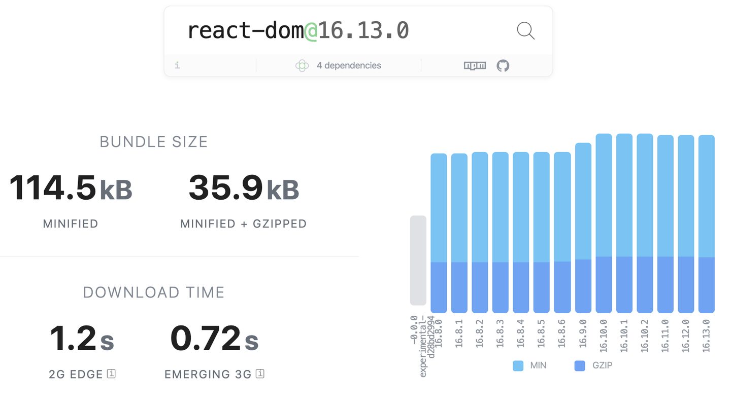
If most of your users' devices support Brotli encoding, you can even use Brotli instead of Gzip. According to statistics, compared with Gzip, Brotli can reduce JS file size by about 14%, HTML file size by 21%, and CSS file size by 17%.
Enabling Gzip is very simple. On Nginx, you only need to write this one line of configuration in the configuration file:
gzip on;to enable Gzip. Enabling Brotli is a bit more troublesome. To use Brotli on Nginx, you need to introduce the Brotli module yourself and manually compile Nginx. For specific methods, you can refer to Brotli's GitHub repository。
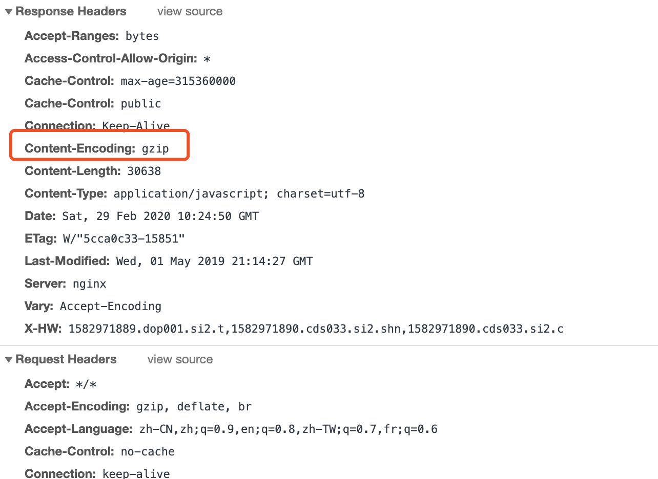
Determining what encoding method a resource uses is very simple—just look at the type of Content-Encoding returned by the resource. The encoding method used in the screenshot below is Gzip.
Gzip or Brotli are certainly good, but not all resources need to be compressed with Gzip or Brotli. For example, image resources do not need to be compressed a second time. This is because the two are better suited for compressing text content, and are not very suitable for binary content like this—sometimes they may even increase the size.
Deliver the optimal resource format/type for different devices
Images
Common image formats include JPEG, PNG, and GIF, and each image format plays a different role. JPEG is mainly used to display static images. It uses lossy compression, so the file size is relatively small, and it is also one of the most common image formats. PNG is also used to display static images, but one advantage it has over JPEG is that it supports transparency. It also supports lossless images. GIF, on the other hand, is the animated image format we commonly see. Web pages mainly use it to display small animations, some interesting memes, or movie clips, etc. Images play a very important role on web pages. According to statistics from HTTP Archive, on average, 60% of the loading traffic of a page is images. Therefore, image optimization is crucial.
In fact, some browsers support certain newer image formats, such as WebP, which can achieve a smaller image size than other formats at the same quality. WebP is an image format introduced by Google. It can display static images, support transparency, and also display animated images. In the field of static images, it can be said to be the current leader. At the same quality, its image size is about 26% smaller than that of PNG, and it can still support transparency. Compared with JPEG, WebP also has an advantage of about 25%-35%. In the field of animated images, however, WebP is not as impressive. Currently, WebP is supported in Android browsers as well as Chrome and Opera, so if all of your users' devices support WebP, then hurry up and start using WebP.
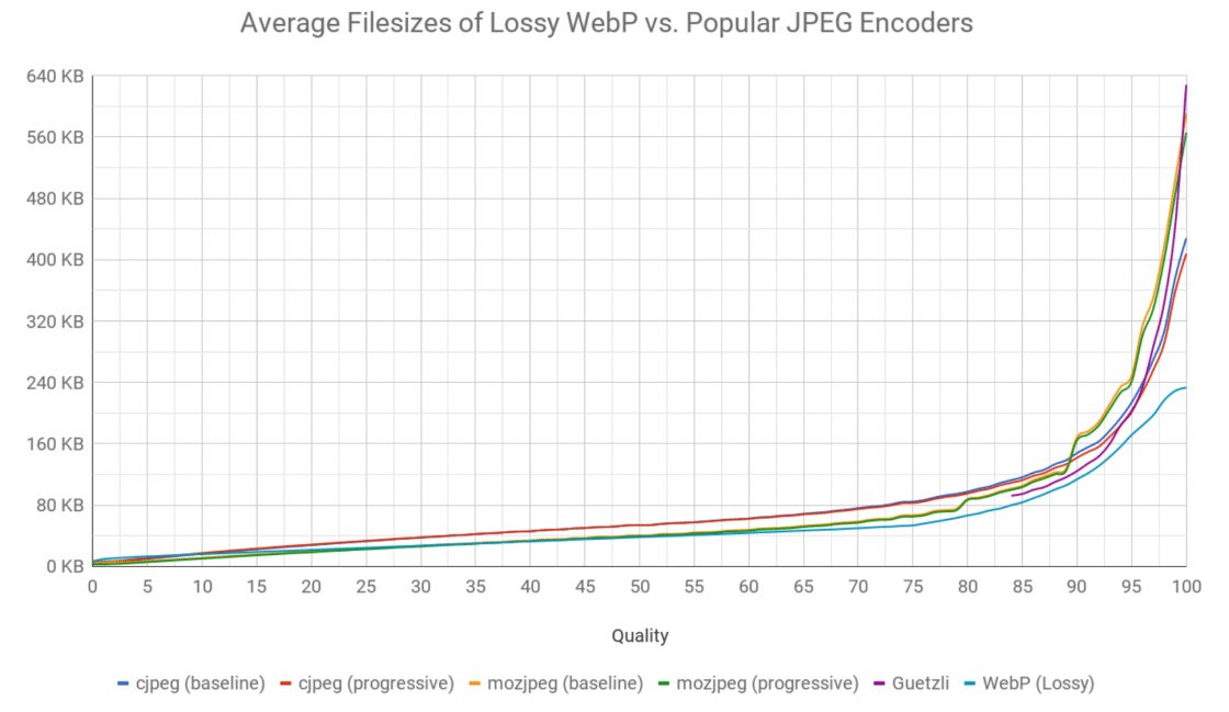
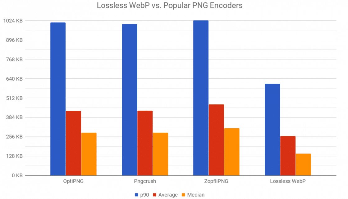
So in the field of animated images, which format is better than WebP and GIF? The answer is APNG. At the same quality, APNG is about 15%-30% smaller in size than GIF, and APNG supports more colors, so the effect it displays is even better than GIF. Smaller in size than GIF and better in effect—isn't this the most perfect animated image format? Unfortunately, not all browsers support APNG. Currently, only Chrome 59 and above, Safari 8 and above, and Firefox 3 and above support APNG. If only some of your users support APNG, then you can also deliver APNG-format images only on browsers that support APNG, and continue using GIF on browsers that do not support it.
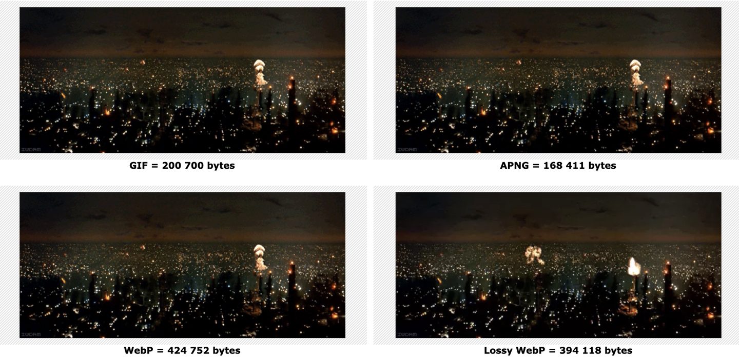
In addition to the reasonable use of image formats, the size of images also needs to be used reasonably. If your users will access your website using both mobile devices and desktop devices, then you had better provide images in two resolutions for display. On mobile devices, because the screen is smaller, displaying larger-sized images is meaningless and will only slow down page loading performance. On desktop devices, however, the image size cannot be too small; if it is too small, the images will appear very blurry, affecting the user experience. To achieve intelligent switching of image sizes, you can use
srcset to achieve this:<img srcset="elva-fairy-480w.jpg 480w,
elva-fairy-800w.jpg 800w"
sizes="(max-width: 600px) 480px,
800px"
src="elva-fairy-800w.jpg" alt="Elva dressed as a fairy">Flexible use of image formats and flexible adjustment of image dimensions both require converting the original image. If you were to do this yourself, it would be very troublesome, and each image might end up being output in many versions. Rather than maintaining multiple versions of images yourself, it is better to use existing services for this. Cloudinary abroad and Alibaba Cloud OSS domestically can both implement all the functions mentioned above. They can return different image formats and image dimensions by adding different parameters to the image URL. They can also implement features such as image watermarks and image filters. From a return-on-investment perspective, using these services often costs less and yields higher returns than maintaining them yourself.
Fonts
Similar to image formats, web fonts also come in multiple formats, and the file sizes of different formats differ significantly. Currently, the more common font formats are EOT, TTF, WOFF, and WOFF2. Among them, EOT is uncompressed and is mainly used for compatibility with IE8 and earlier browsers. If your users do not use IE, then you should avoid using EOT as much as possible. TTF is currently the font format with the best compatibility, and you can usually use it as a fallback to display fonts. WOFF is a relatively new font format that compresses fonts, so it has a certain advantage in file size compared with TTF, and modern browsers basically all support WOFF fonts. WOFF2, as the name suggests, is an upgraded version of the WOFF font. It has a smaller file size and better performance, so it can be said to be the optimal font format. Unfortunately, its compatibility is relatively poor.
Fortunately, when defining web fonts in CSS, you can declare multiple src entries to achieve flexible selection of different font formats, for example:
@font-face {
  font-family: FontNam
  src: url('path/filename.woff2') format('woff2'),
    url('path/filename.woff') format('woff'),
    url('path/filename.ttf') format('truetype');
}
In this way, browsers that support WOFF2 will preferentially use the WOFF2 font; if they do not support it, they will fall back to the WOFF font; and if that is also not supported, then the final TTF font will be used.
In our own business, based on actual usage, the file size of WOFF2 fonts is about 70% smaller than that of TTF, and WOFF fonts are about 50% smaller than TTF fonts, so the benefits are very clear.
JS code
There is currently a trend on the web for more and more pages to use Webpack or similar bundling tools to bundle the JS and CSS resources of a page. When writing code, developers use ES2015+ syntax, and ultimately the code is bundled by the Webpack bundling tool into an ES5 version of the code in order to be compatible with lower-version browsers.
But if the browser versions used by your users are relatively high and can natively support ES2015+ syntax, then bundling the code into ES5 code actually increases the size quite a bit, because adding Polyfills increases code size. Fortunately, just like with fonts, we can also load different versions of code in different environments based on browser support.
Chrome 61 and above support
<script type="module"> feature, while browsers that do not support this feature will ignore this tag. In this way, you can use <script type="module"> and <script nomodule> to automatically use different versions of code according to different environments, such as:<script src="/bundle.mjs" type="module"></script>
<script src="/bundle.es5.js" nomodule></script>In our business, this optimization method is already in use. The ES2015+ version of the code is about 20% smaller in size than the ES5 version of the code. A smaller code size not only speeds up code download, but also reduces code parsing. Especially on mobile devices, the smaller the size, the smaller the difference in parsing time.
Use Preact to replace React
If your project uses React to build pages, then you might consider using Preact as a painless replacement for React. Compared with React, Preact is more than 10 times smaller in size. And even better, Preact claims 100% support for React's API. If you want to switch an existing project to Preact, you only need to configure an alias in Webpack, with no need to change any business code. For the specific steps, you canrefer to Preact's official documentation。
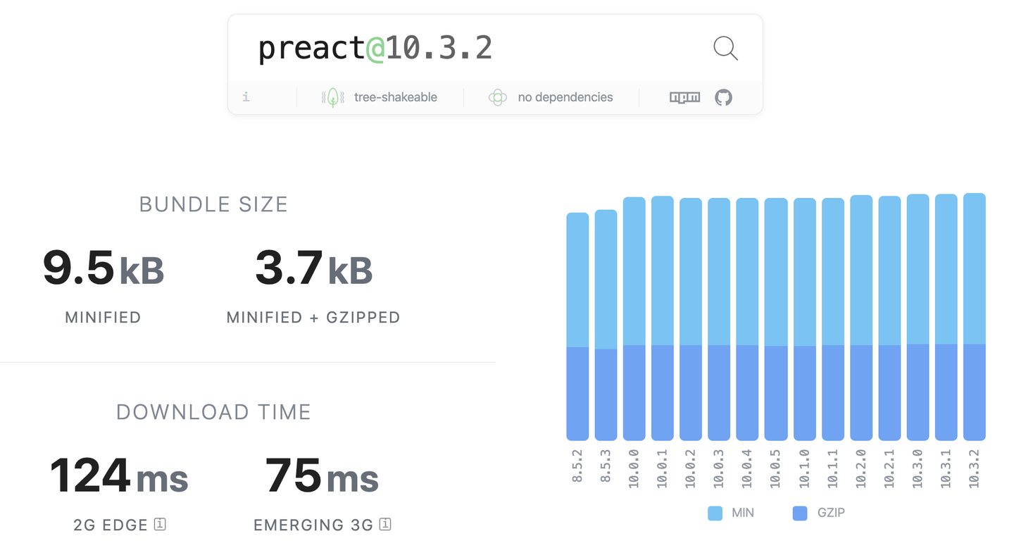
In our own business, we truly achieved this without changing any business code—simply replacing React with Preact enabled all business functionality, and the overall page size was reduced by about 30%. This is a quite stunning result: only a very small investment yields fairly large returns. Therefore, this is also a very worthwhile optimization to make.
Reusing HTTP connections
Creating an HTTP connection is not a trivial overhead—at minimum tens of milliseconds, at most hundreds of milliseconds. If HTTP connections are not reused, then each request will create a separate HTTP connection, which will inevitably slow down page loading. Therefore, properly reusing HTTP connections is also a very good optimization approach.
keep-alive in HTTP 1.1
In HTTP1.1, requests are keep-alive by default, meaning that the current HTTP connection will not be closed immediately after transmitting the current resource, but will continue to be reused. This improves the connection issues of the HTTP1.0 era to some extent. Pages at the current stage are basically HTTP1.1, so in most cases you do not need to worry about this part.
However, there is one point to note: in the HTTP1.1 protocol, each HTTP connection can transmit only one request at a time, so if you send two requests simultaneously under the same domain, two HTTP connections will be created separately, and therefore the connection still cannot be reused. In this scenario, if you want to reuse HTTP connections, you need to use the HTTP2 protocol.
HTTP2
HTTP2 is a full-duplex, multiplexed protocol that fundamentally solves the problem of HTTP connection reuse. Under the same domain, no matter how many resources you request concurrently, in theory only one HTTP connection will be created, and all requests will be completed over that connection.
In scenarios with a large number of concurrent requests, using the HTTP2 protocol will be considerably faster than the HTTP1.1 protocol, because each request saves the time needed to create an HTTP connection, and as a result the total load time is reduced.
However, HTTP2 must run over HTTPS. Therefore, if your website originally used the HTTP protocol, then to use HTTP2, in addition to deploying HTTP2 support on the server side, you also need to purchase the corresponding HTTPS certificate, etc. In addition, in some scenarios HTTP2 may not be faster than HTTP. This is because creating an HTTP2 connection involves an extra TLS handshake, which in environments with relatively high network latency may affect the overall loading speed, so in such scenarios its actual performance may not be as good as HTTP. Therefore, you should first understand your users' network conditions before deciding which protocol to use.
Currently, most modern browsers support HTTP2. Chrome 41 and above, Firefox 36 and above, and Opera 28 and above all support HTTP2.
Page offlining
So-called offline capability means that all of a page's resources are stored offline in the browser, so that when a user visits the page, it can be rendered without making any network requests.
Service worker can achieve this capability: it can register a service worker when the page is first visited and cache all of the page's resources. When the user visits the page a second time, the page content is read entirely from the service worker's cache. Service worker is a relatively common optimization approach in the industry, and its advantages are very clear: as long as the data has been cached, subsequent page visits are very fast. But it has a drawback: updating page content is relatively complicated. If the page content is updated, the user must wait until the next page visit to see the new content. It also has a limitation: it cannot speed up a new user's first visit. The first visit still requires downloading all of the page's resources.
In addition to Service worker, there is currently another containerization technology that can achieve page offline capability. It relies on a proprietary client to implement a set of standards. When the client starts, it silently downloads the configured offline pages in the background, and when the user actually visits these pages, they can be read directly from the offline cache. Because this is not an open, standard technology, implementations differ across major companies. The containerization technology implemented by the team I am on can achieve offline capability for a page's static resources as well as prefetching of page API endpoints. In this way, as long as users open our pages using our own client, everything they access is read from local offline content, and web page loading speed is very fast. At the same time, because loading of offline pages begins when the client starts, this optimization applies not only to existing users but also to new users. This technology is revolutionary, and the effect is very obvious. Of course, this technology is limited to being able to achieve such capability only in one's own client. On third-party platforms/browsers, achieving similar capability can only be done using service worker.
Lazy-load resources appropriately
Code Lazy Loading Besides Service Workers, there is currently another containerization technology that can achieve page offline capability. It relies on a proprietary client to implement a set of standards. When the client starts, it silently downloads the configured offline pages in the background, and when users actually visit these pages, they can be read directly from the offline cache. Since this is not an open, standard technology, implementations vary across major companies. The containerization technology implemented by the team I work with can achieve offline capability for static page resources as well as pre-requesting page API endpoints. As a result, as long as users use our own client to open our pages, everything they access is read from local offline content, and web page loading speed becomes extremely fast. At the same time, since the loading of offline pages begins when the client starts, this optimization applies not only to existing users but also to new users. This technology is revolutionary, and the effect is very obvious. Of course, this technology is limited to being achievable only within one's own client. On third-party platforms/browsers, the only way to achieve similar capabilities is to use Service Workers. Appropriately lazy-load resources Code Lazy Loading Those familiar with Webpack should know that by default, webpack ultimately bundles and generates a single bundle file, which contains all the code for the page. For an SPA application with many pages, if users have to fully download all the code of the entire application every time they visit a page, that is quite wasteful. Webpack provides a way to load asynchronous code. By using dynamic import, on-demand code loading can be achieved, and the download only actually happens when that dynamic module needs to be executed. In React, lazy loading functionality can be implemented by using , which enables on-demand module loading or on-demand page loading, and the loading size for a single page will also be much smaller.
Those familiar with Webpack should know that by default, webpack ultimately bundles and generates a single bundle file, which contains all the code for the page. For an SPA application with many pages, if users have to fully download all the code of the entire application every time they visit a page, that is quite wasteful. Webpack provides a way to load asynchronous code. By using dynamic import, on-demand code loading can be achieved, and the download only actually happens when that dynamic module needs to be executed. In React, this can be done by using
React.lazy to implement lazy loading functionality, which enables on-demand module loading or on-demand page loading, and the loading size for a single page will also be much smaller.In our project, we implemented URL-based code lazy loading by using React Router and React.lazy, and on our core pages, in order to ensure page loading speed, we lazy-loaded non-core modules on the page. These lazy-loaded modules are downloaded asynchronously only after the page has finished rendering, prioritizing the display of the main content in order to speed up page loading.
Image Lazy Loading
The previous section mentioned that images occupy a very important position in pages, with 60% of web traffic being images. But in fact, some images can also be loaded through lazy loading.
A very typical scenario is lazy loading images that are outside the viewport, so that only images displayed within the viewport are loaded immediately. The benefit of doing this is that it shortens the page's onload time. Suppose there is an image list page; if lazy loading is not implemented, the page will not trigger the onload event until all images in the list have finished downloading. But if images outside the viewport are lazy loaded, the page only needs to load a few images within the first screen, and the page's onload event will be triggered earlier. In addition to shortening the onload time, it can also speed up the loading of first-screen images. Originally, all images needed to be downloaded concurrently, and the download speeds of the images would compete with one another, so the download speed each image could get was often relatively low. But if only a few first-screen images need to be downloaded, then on average each image can be allocated a higher download speed, so the images can be displayed earlier.
So when exactly do lazy-loaded images start loading? In our project, we set them to start loading only when these lazy-loaded images are exposed within the viewport. We used Intersection Observer to implement exposure monitoring. On our core pages, by using the lazy loading feature, the page loading performance has been greatly improved.
However, lazy-loaded images have a small drawback: when these images begin to appear within the viewport, they need some time to load, and only after loading is complete can the image content be displayed. During the loading process, you can only see a placeholder. This has some impact on the user experience. Of course, this problem can also be solved through Resource hints.
Use Resource hints to preload page resources
Resource hints refer to preload, prefetch, and preconnect. The purpose of these technologies is to hint to the browser which resources may be needed next, so that the browser can load these resources in advance. The problems these technologies aim to solve are not exactly the same. In fact, prerender also counts as a resource hint, but because its use cases are too few, it will not be discussed here.
Preload
Preload is a relatively new specification. It is used to hint to the browser that the current page may use certain resources. When the browser downloads these resources, it can, according to the configured
as attributes to set different priorities. For specific usage, refer to MDN's documentation. In actual business scenarios, the use cases for preload include:Preloading asynchronous resources
Preload is very suitable for preloading asynchronous resources, such as the code lazy loading mentioned above. If preload is not used, these lazily loaded resources will only start downloading when the code execution reaches them. This results in a loading process. If preload is used to preload these asynchronous resources, it is equivalent to being able to omit this loading process. Moreover, since preload does not affect the page's onload event, we can safely preload without worrying that preloading asynchronous resources will affect the overall page loading performance.
Using preload is very simple; you only need to insert a link tag in the HTML:
<link href="/async-script.js" as="script" rel="preload" />In fact, in our business, we also use preload to preload asynchronous modules in core pages, thereby speeding up the display of asynchronous modules.
Preloading web fonts
Another very typical use case for Preload is preloading web fonts. Before using preload to preload fonts, the download timing of fonts is often relatively late. It needs to wait for the CSS file to finish downloading and parsing, and for content using that font to appear in the HTML before it starts downloading. This causes the page text to display as blank before the font has finished downloading.
Using preload, however, can directly advance the loading of the font file, allowing the text on the page to be displayed more quickly. This optimization has also been applied in our business. After using preload, text blanking almost never occurs during page content rendering. Preloading fonts with preload is also very simple; you only need to set
as attribute to font , and set crossorigin and that's it:<link href="/myfont.woff2" as="font" rel="preload" crossorigin type="font/woff2" />Pre-requesting API Endpoints
In addition to preloading fonts and asynchronous resources, Preload can also preload API endpoints. This is a feature that few people use, but if used flexibly, it can bring significant optimizations to SPA applications.
Preloading API endpoints essentially moves up the timing of when the page's API endpoint requests are sent. In an SPA application, you usually have to wait for the JS code to finish downloading and parsing before the API request is triggered, and before the API request returns, the page often has no actual content. As a result, users have to wait for a relatively long time. If you use preload to preload API endpoints, then as soon as the page's JS code finishes downloading and parsing, the data can be obtained immediately (assuming the preload has already finished before the JS code finishes downloading), and at that point the page content can be rendered and displayed earlier.
According to statistics from our business, API endpoints usually take several hundred milliseconds or even one to two seconds to complete a request, so preload may save your page several hundred milliseconds to one to two seconds of loading time.
However, using preload to preload API endpoints has some limitations. It can only use the GET method to request endpoints, and for the preload result to take effect, the preload and the actual API request sent by JS must be completely identical in request URL, request method, and request headers. Manually adding or modifying request headers in the API request sent by JS will cause the preload to become ineffective.
Therefore, although preloading API endpoints is quite powerful, due to its many limitations, we have not used it in our actual business. If your business meets these requirements, then you can try using this approach to optimize API requests.
A simple API preload code example is as follows:
<link rel="preload" href="https://api.github.com/users/octocat" as="fetch" type="application/json" crossorigin="" />Prefetch
Prefetch is very similar to preload, except that it is much "older" than preload. It was proposed a long time ago, and initially people used it to preload resources for the next page visit, such as preloading the document for the next page in a paginated list.This MDN articlecan help you answer some common questions about prefetch. Typical use cases for Prefetch include:
Preloading the main document of the next page
If you use prefetch to preload the main document, the browser will parse and download that main document and store it in the HTTP cache. Even if the URL goes through a 30X redirect to a new URL, prefetch can follow it. The next time the user visits this page, the content of the main document can be read directly from the cache. However, the browser will only download the main document for you, which means it will only download the HTML content and will not download the resources referenced in the HTML, etc.
This optimization approach has a certain effect. In our business, there is a page with a scenario where users jump to a third-party page, and most users will jump to this third-party page. Therefore, we use prefetch on this page to load the main document of the third-party page in advance for users, so that when users jump to the third-party page, the page can open faster, after all, saving the processes of domain name resolution, HTTP connection creation, and HTML document download. The simplest example can be like this:
<link href="https://developer.mozilla.org/en-US/" rel="prefetch" />Preloading lazy-loaded images
“Preloading lazy-loaded images” may sound like a tongue twister, but it is actually meant to solve the user experience problem mentioned in the “image lazy loading” section above.
When images use lazy loading, the timing of their download becomes uncertain, so when the user sees an image, it may have only just started downloading. What if we use prefetch to load these lazy-loaded images in advance? Then these lazy-loaded images will be downloaded ahead of time, and when these images enter the viewport, image loading will be triggered, reading directly from the prefetch cache, so the images will be displayed very quickly, and users will hardly notice the image loading process.
The reason prefetch can be used to preload these lazy-loaded images is that prefetch loads resources at a very low priority and will load them whenever the browser is idle as much as possible, so that we can load these lazy-loaded images as early as possible without affecting the loading of other resources on the page.
This technique has also been applied in our business. On our image list page, we use both image lazy loading and prefetch to preload these lazy-loaded images. The resulting user experience is good, and the overall page performance data has not been affected.
One thing to note is that no matter what type of resource is preloaded using prefetch, if the response header returned by that resource declares
cache-control: no-store , then the prefetch cache will not take effect. In other scenarios, such as cache-control: no-cache or max-age=0 the prefetch cache will still take effect. Therefore, if the resource's response header contains cache-control: no-store , then prefetch should not be used to preload it.Preconnect
Preconnect can be used to create an HTTP connection to a certain domain in advance. This process includes DNS resolution, TCP connection creation, and TLS connection creation. When the browser requests a resource under this domain, it can directly reuse the preconnected HTTP connection.
Preconnect is very suitable for creating HTTP connections in advance for some dynamic URL requests. For example, creating connections to API endpoints in advance. The effect of using preconnect is shown in the figure below:
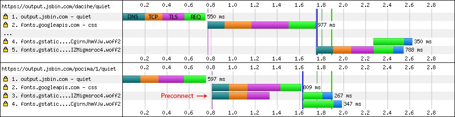
We use preconnect to create HTTP connections in advance for our dynamic data, such as API endpoints and image resources. The benefits of preconnect may not be that obvious, but it can indeed improve some performance. And it is very simple to use—just a simple link tag:
<link href="http://baidu.com" rel="preconnect" />
<!-- 如果是 preconnect 跨域接口的话需要加上 crossorigin -->
<link href="//api.host.com" rel="preconnect" crossorigin="anonymous" /
In addition, note that if the HTTP connection you create in advance through preconnect uses the HTTP1.1 protocol, then this connection can only transmit one request at a time. For the specific reason, you can directly refer to the "Reusing HTTP Connections" section above. For concurrent requests, the optimal optimization method is to use preconnect + HTTP2 to optimize the creation of HTTP connections.
Use skeleton screens to optimize user experience
The so-called skeleton screen means that when the page has not yet rendered the complete content, a rough skeleton is first drawn on the page, so that the page is not so dull and boring during loading, and users can also understand in advance the overall layout skeleton of the page that follows. For example, a screenshot of Slack's loading process:

Before we used skeleton screen optimization, our page would load as a blank white screen. After using skeleton screens, the page's interactive experience improved a lot, and the page's First Paint and First Contentful Paint both improved to a certain extent. Although skeleton screen content is not really actual content, and improving the First Paint performance data was not the main goal of this optimization, the main reason we did this optimization was more to improve the user experience. For this part, you can refer to this great article:Content Placeholders: A Way to Style Waiting Time。
Summary
Performance optimization is an eternal topic; performance should never be ignored at any time or moment. We should also carry out performance optimization in a targeted way. After a series of performance optimizations, the business I was responsible for achieved phased improvements in performance data. Most of the methods used were those mentioned above. Of course, doing these optimizations does not mean that things end there. Performance optimization is a protracted battle, and we should continuously pay attention, continuously practice, and continuously research.